CASE STUDY/WEBSITE
Introduction
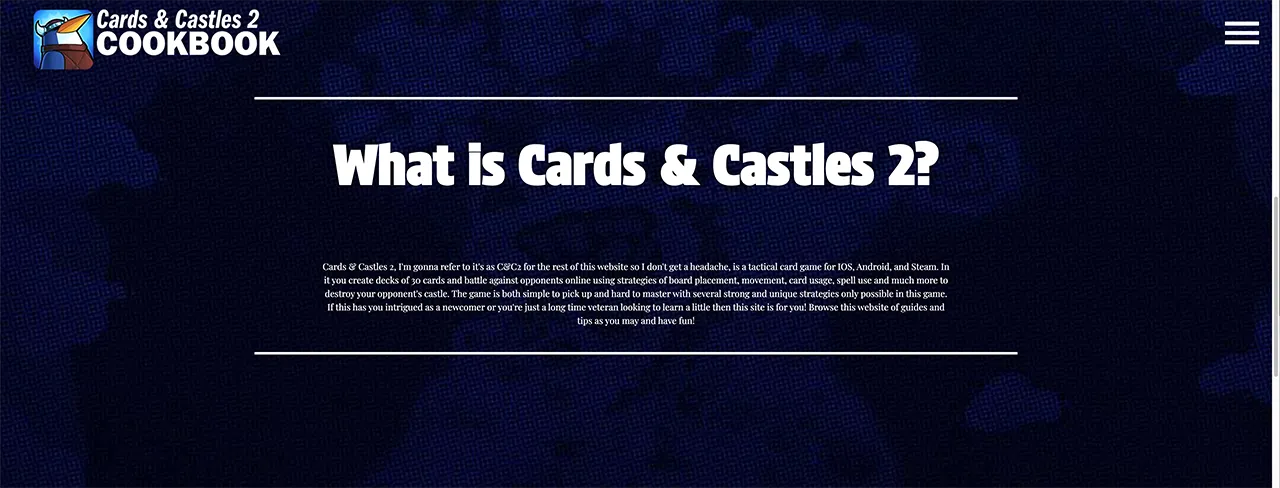
This website was designed as a strategy guide for new players looking to get into my favorite mobile card game, Cards & Castles 2. It runs through tips for 3 very integral aspects of the game, building decks, choosing your factions, and playing actual matches against other opponents. I intend to have players be able to enter with a beginner level of understanding of the game and be able to leave with a clear path forward on how to compete in the game.
Personas
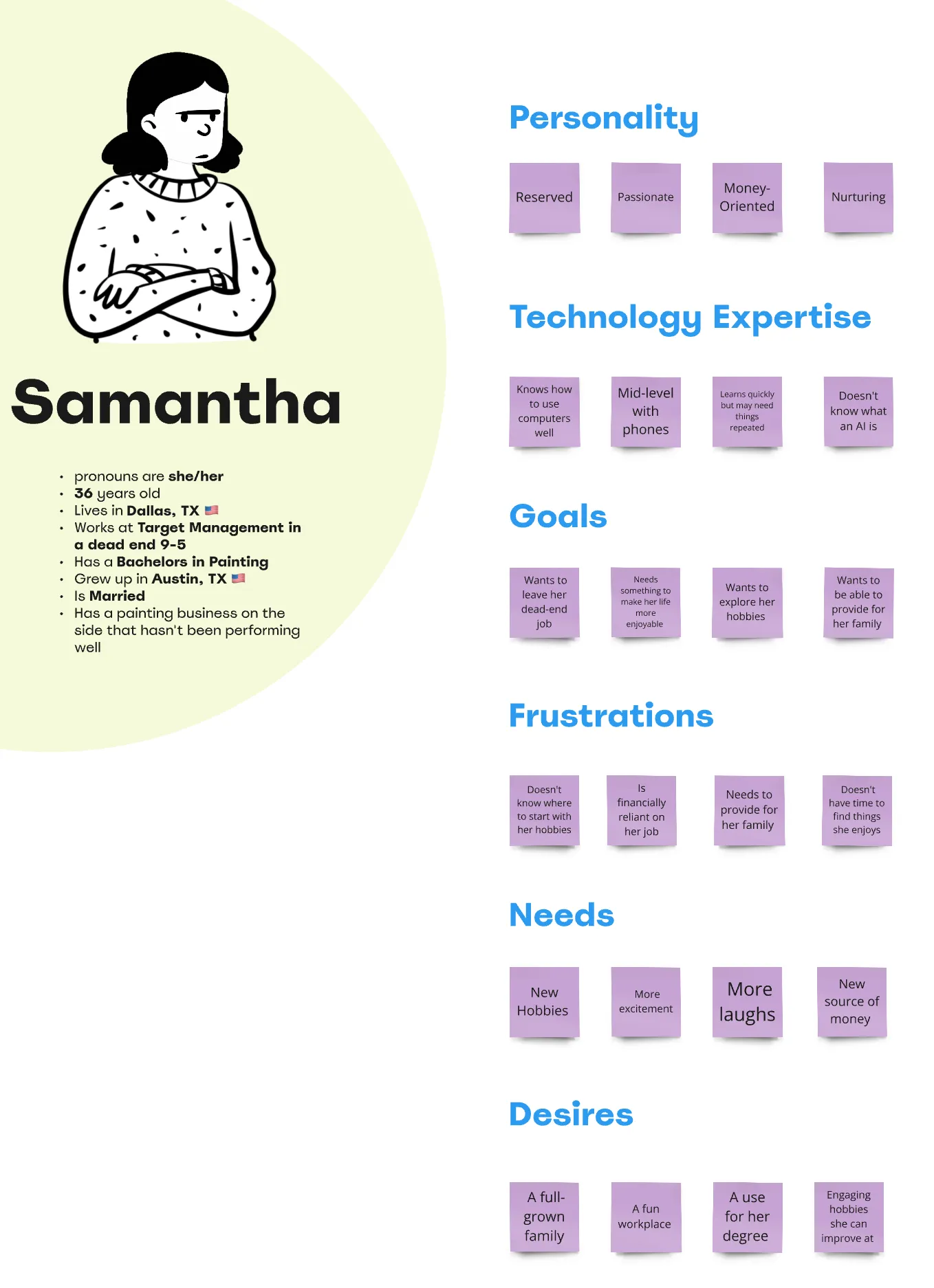
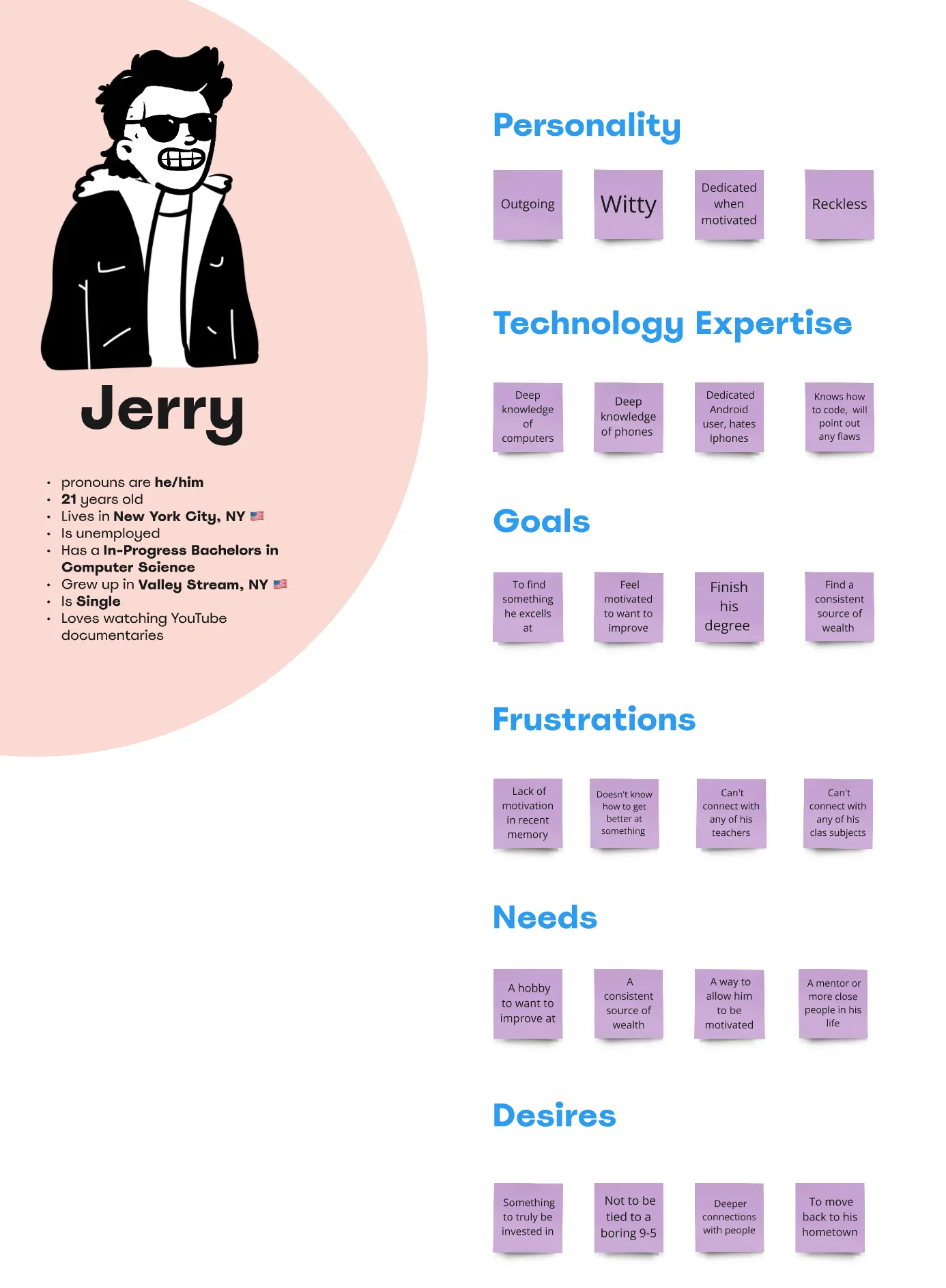
I started my ideation by creating user personas for people that might use this website (with this being at the very beginning of my ideation that are not fully accurate to a user-base of the website)
These users were generally aimed at people who were driven with a want to improve and compete or were people looking on with curiosity and interest at the deeper mechanics of the game and needed a diving board to help them get into the deep of it.
Site Map
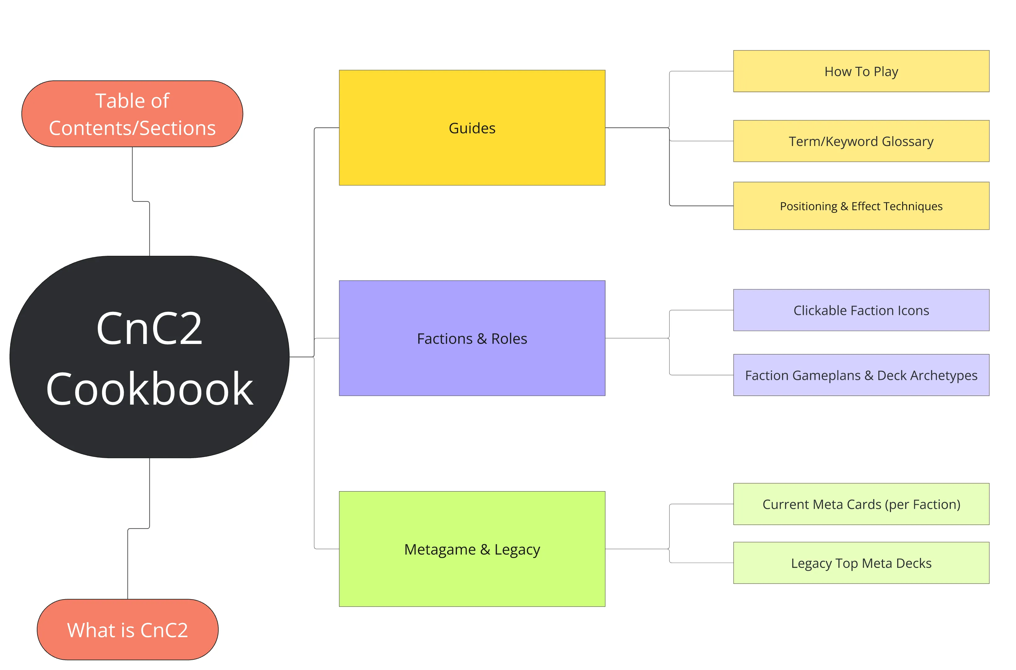
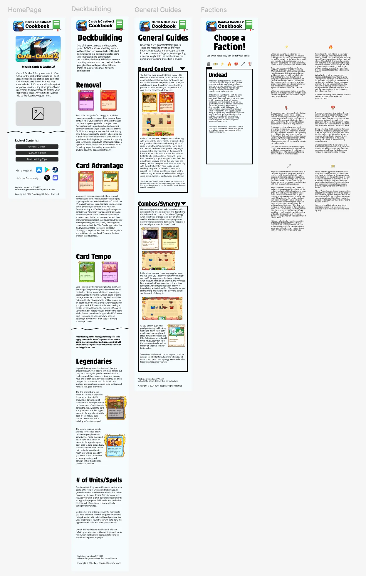
I next laid out what the general page and topic structure of the website would look like. I separated each page into what I believed to be the most important aspects of the game to learn, these three page topic ended up changing by the end with me not seeing the Metagame to be as important factor and I would go on to separate Guides into Deckbuilding Guides and General Guides. I also clearly defined what these pages would be conveying to the viewer. This would help me throughout the website when it came to writing content for the pages and researching that content as I had a clear outline of the website defined for me.
Wireframes
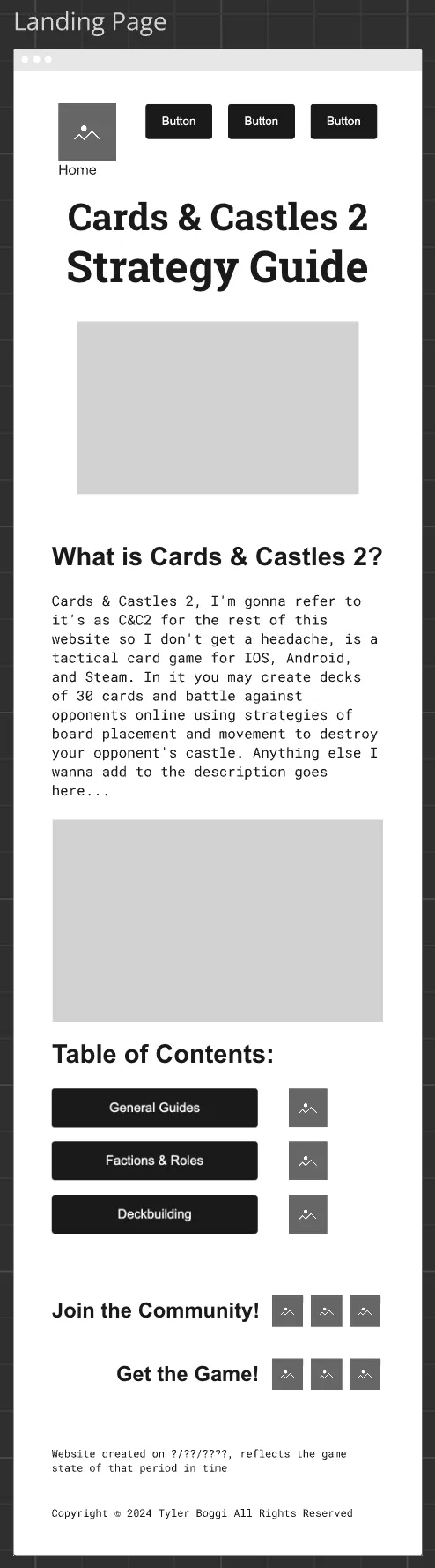
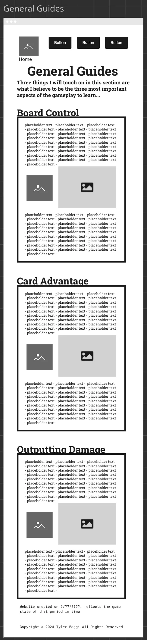
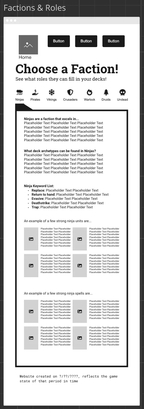
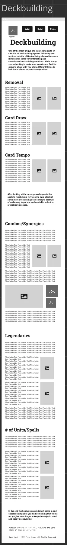
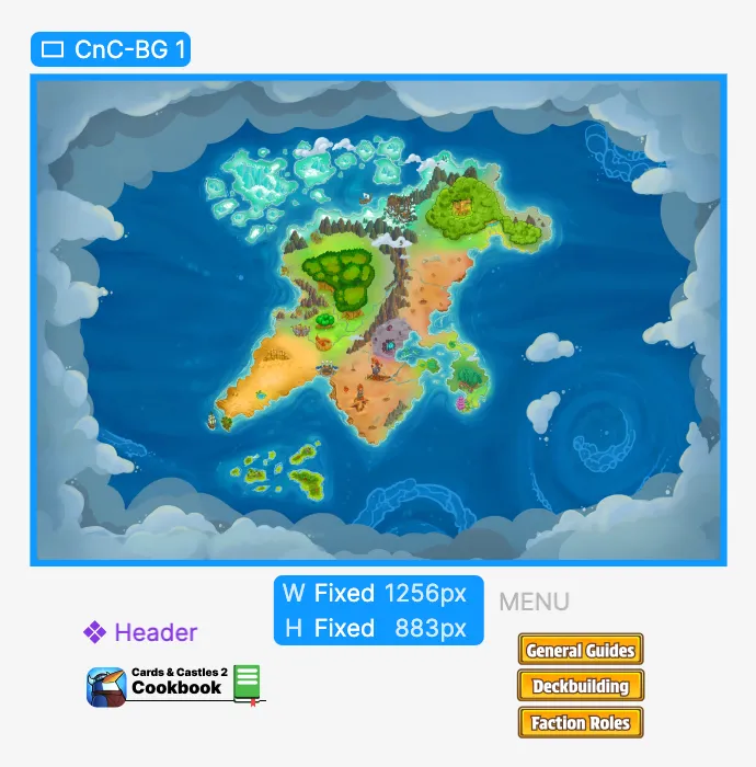
I then made the wireframe for the design of the website itself. This was much more of a blocky but literal representation of how the website would be layed out. I used this to mess around and edit the design a bunch until it looked like something I was happy with. This had a similar effect to the site map where it allowed the design part of the website to be guided and easier since I had the initial design to always reference.
Figma Prototype
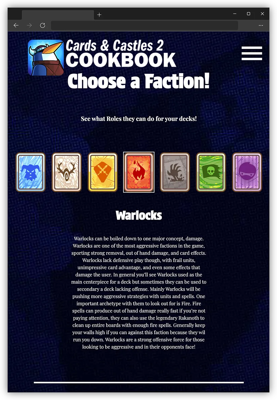
Before I moved to GitHub I made a Figma Prototype for the website which utilized both the site map and the wireframe to make a cohesive design that I could carry over to GitHub for a smooth transition into the final product. This helped me understand how to transition a design to work both with mobile and desktop. I also was able to create several unique assets through this process that I could use in the final website, overall Figma allowed me to fully realize the design and site page concepts before moving into the more complicated software of GitHub.
Development
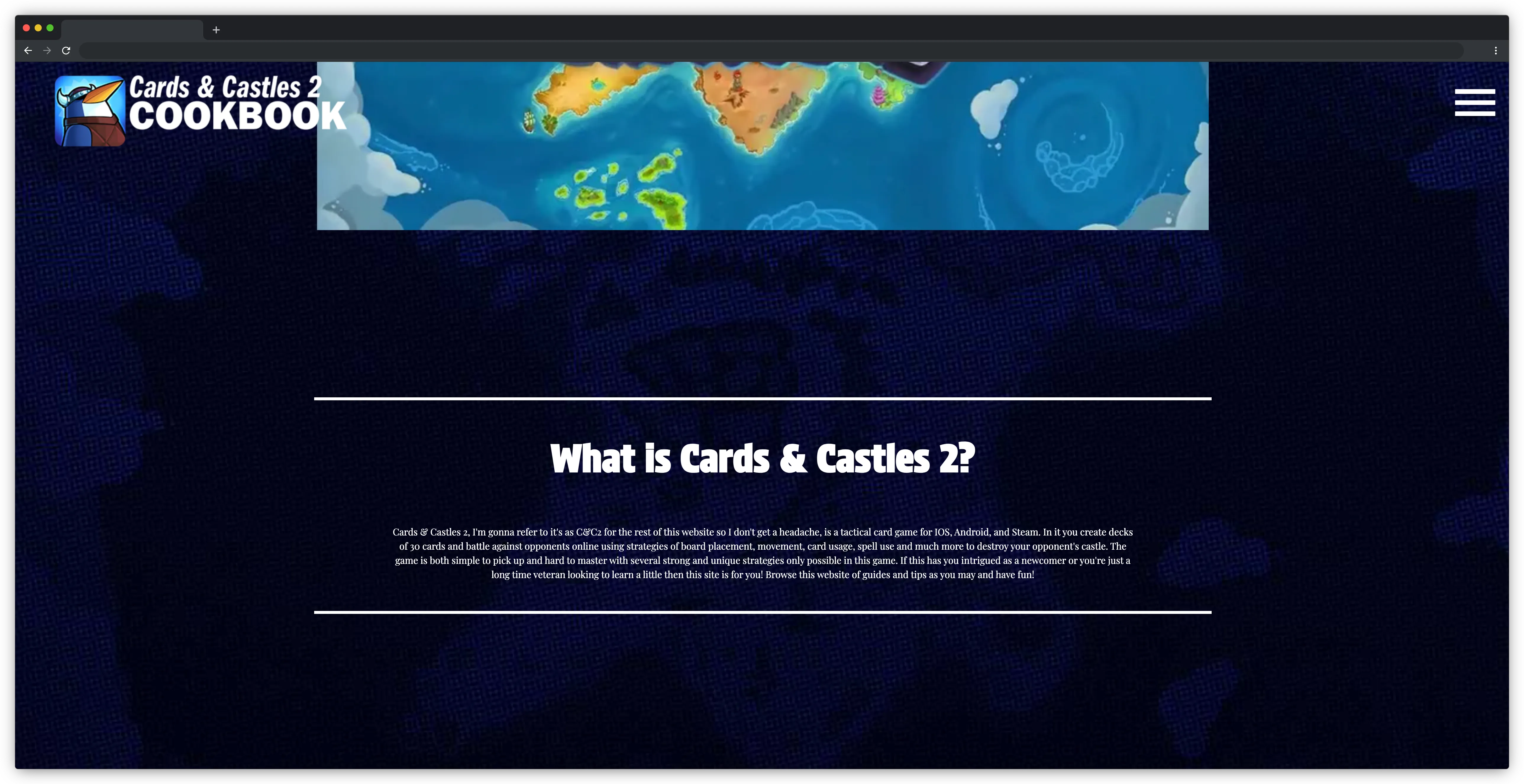
In my process of development I learned a lot about moving my design concept into an actual coding environment. I mostly learned that I need to take into account when I'm designing how I will actually implement that design in the final product. This is because there were a lot of visual factors that I had to rework due to not having the skills, at this moment, to implement them in the code. It was very humbling to know how much work outside of designing goes into building a website and it has honestly inspired me to do more development in that area of my skillset since. Overall through the development process I built the skills to be able to know how to properly transfer a design from its design stage to its functional stage.
©Tyler Boggi 2025